Redesigning Job Platform App and Doubled The Conversion Rate
UX Case Study — Maukerja Mobile App
by Bregga Tedy
Feb 28, 2021 • 8 min read
In this study case, I want to share my experience redesigning a job platform app called MauKerja App. Maukerja App is a product of A Job Thing Sdn Bhd Company which focuses on solving the blue-collar jobs problem in Malaysia. The HQ is in Kuala Lumpur.
When I started joining as a UX Designer at A Job Thing Sdn Bhd in early 2017 I was given a mission to improve the design and experience of Maukerja App as a whole. — Yes Boss!
My Role, the Team, and the Design Process
As I said earlier, I am the UX Designer in this company. I was assigned to the Mobile App team to improve the user experience. UX design is all about creating a positive response so that users will stay longer and come back often. Even better, they recommend our brand to others 🤩
Meeting the user's needs is the bare minimum of what a good product should do. A good product is visually appealing, engaging, and simple. Navigating its features should feel effortless.
UX Audits & Usability Test
To understand the issues with Maukerja's existing app, we conducted user research with participants who use Maukerja with different age ranges. Due to the time constraints of the project, our team focused on identifying the major pain points in 4 key flows: 1) Onboarding, 2) Finding a job, 3) Applying for Job, and 4) Profile Completeness.
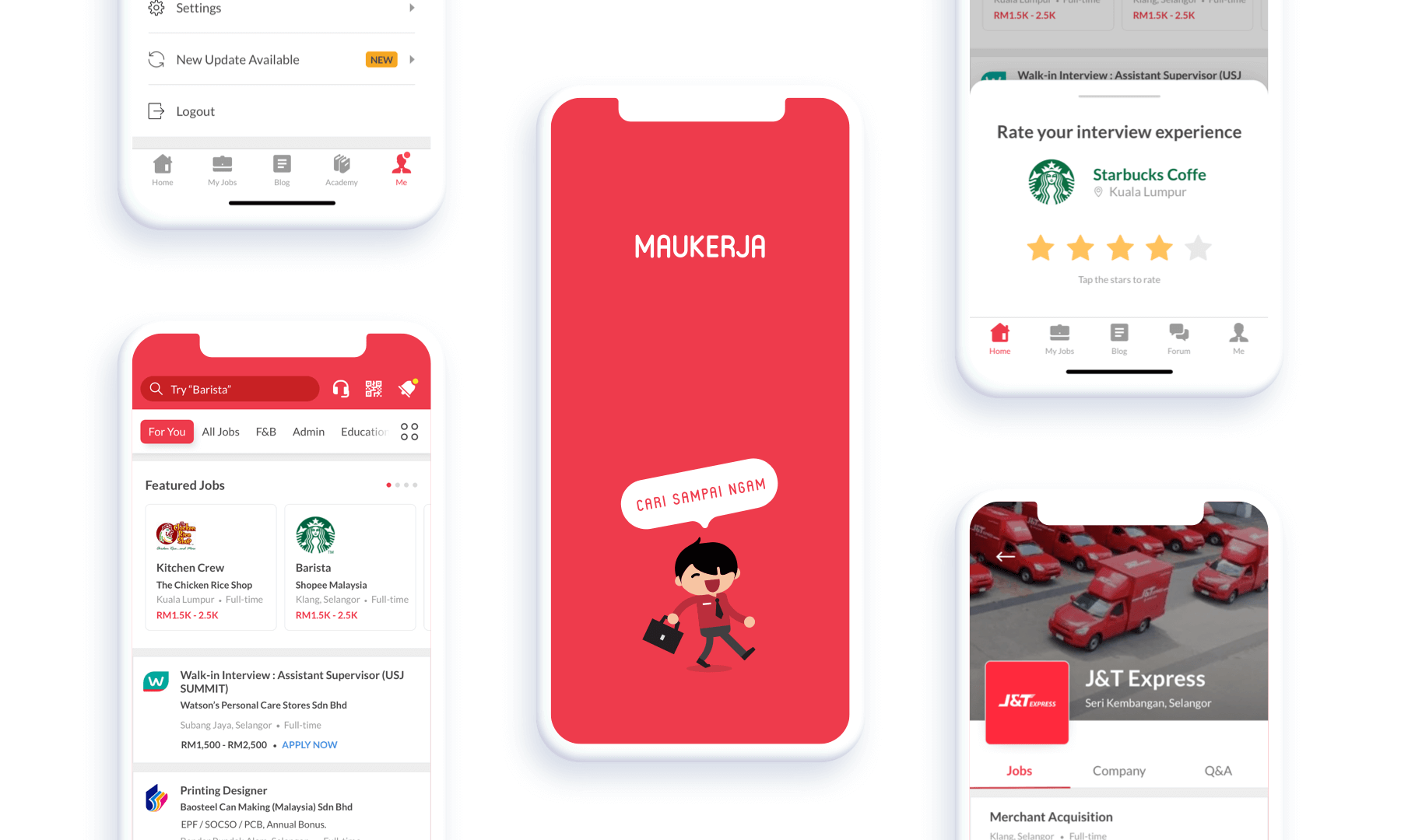
Below are the screen-by-screen flows from the existing app and the respective user journey maps we created to help us visualize the user's feelings (positive, neutral, and negative) as they progress through both flows.
Screen-by-screen flows from the existing Maukerja App
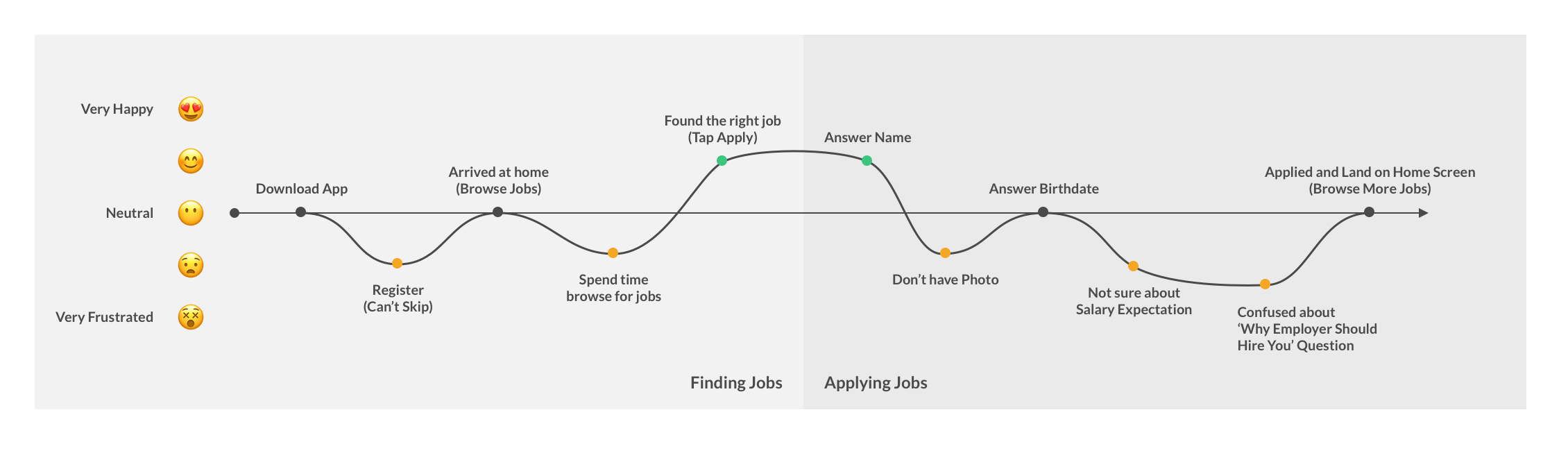
User Journey Map from getting the app to apply for the job
From these UX audits, we deduced the following main pain points that needed to be alleviated:
-
There is no onboarding is to explain how the app works.
-
The app is confusing, unintuitive, and hard to navigate.
-
The user needs lots of time to find the right job.
-
The application process is via chat. Because of its free-text input, the user needs to be very careful when typing. Once the user taps the send button, there is no way they can undo it.
-
The app and the user profiles on it don't seem trustworthy.
Feature Prioritization
Before we jumped into designing any screens, we wanted to nail down the key features within the app that would meet the needs of our users. We brainstormed features and prioritized the most important ones.
-
Add 'Guest Mode'. User can explore the app without register first
-
Provide users with more information about the app, such as introduce the onboarding page
-
Provide several job recommendations on the home page based on the user's interests
-
Change the apply screen and add a confirmation screen before the user send the application
-
Add a thank you page to allow the user to apply for more jobs
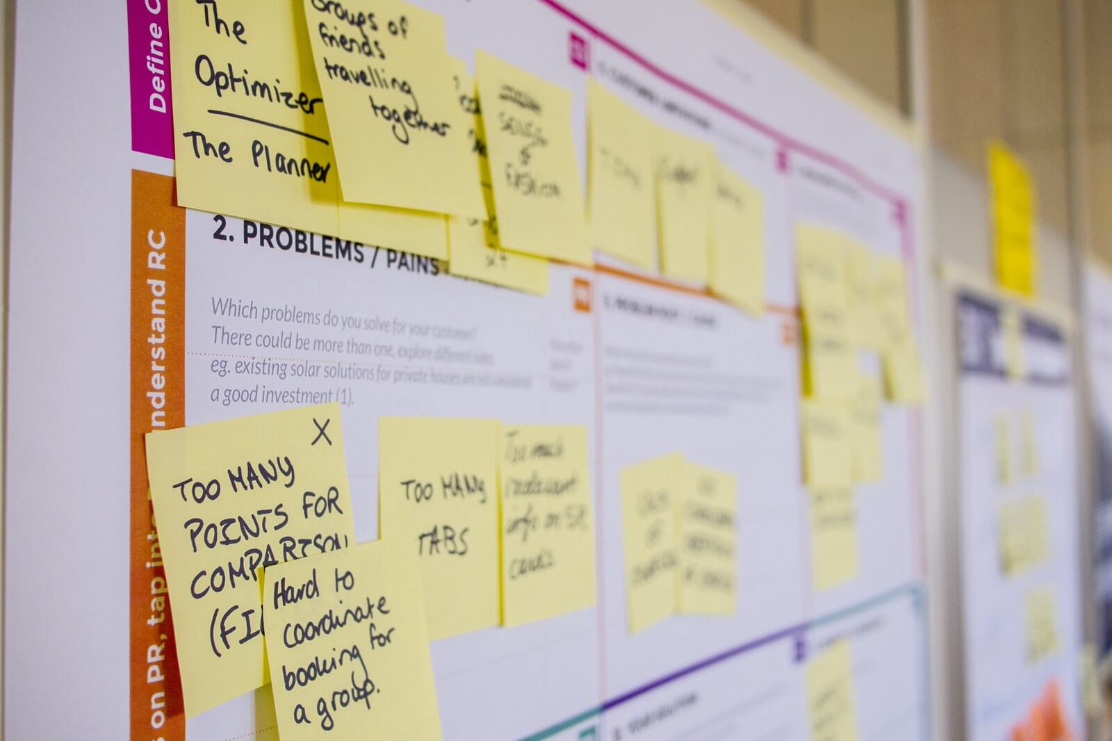
Brainstorm Illustration. Photo by Daria Nepriakhina on Unsplash
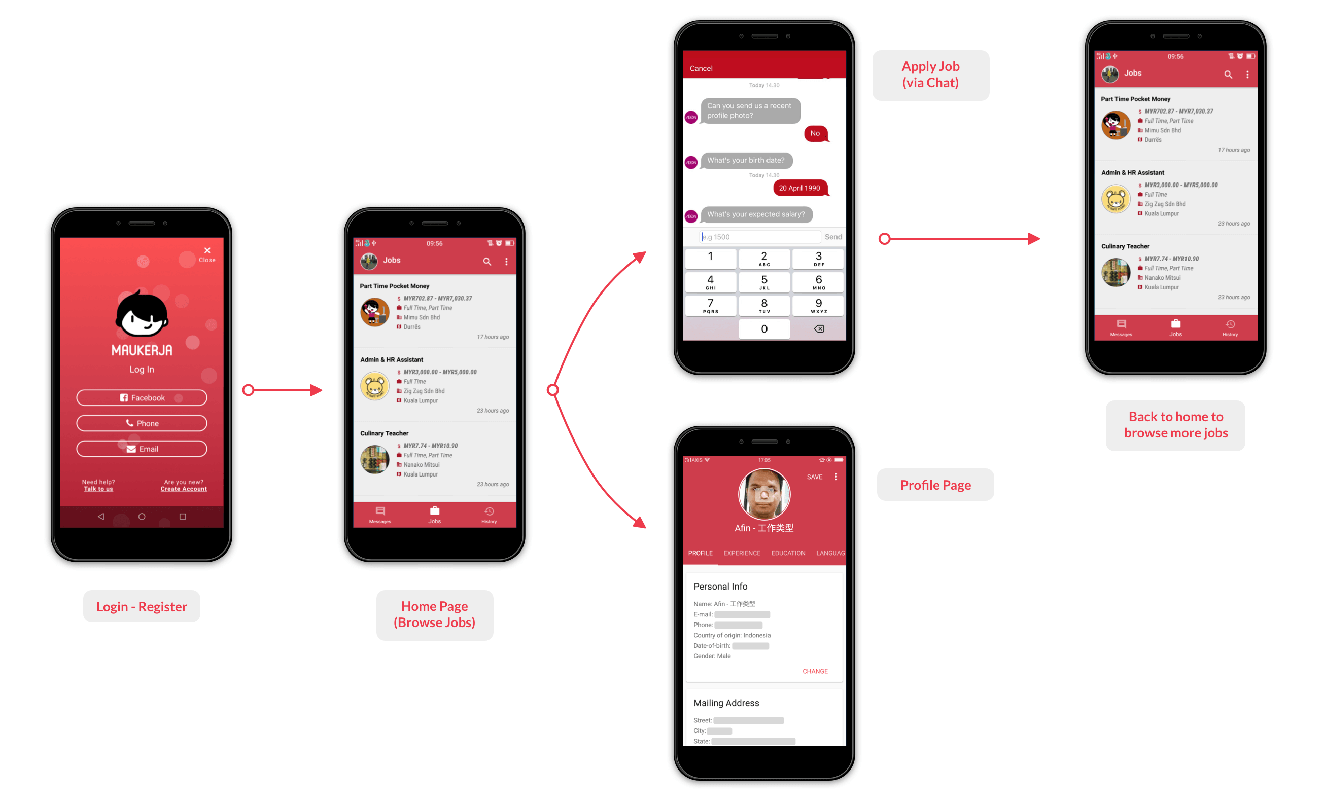
User Flows
Before we jumped into designing any screens, we wanted to nail down the key features within the app that would meet the needs of our users. We brainstormed features and prioritized the most important ones.
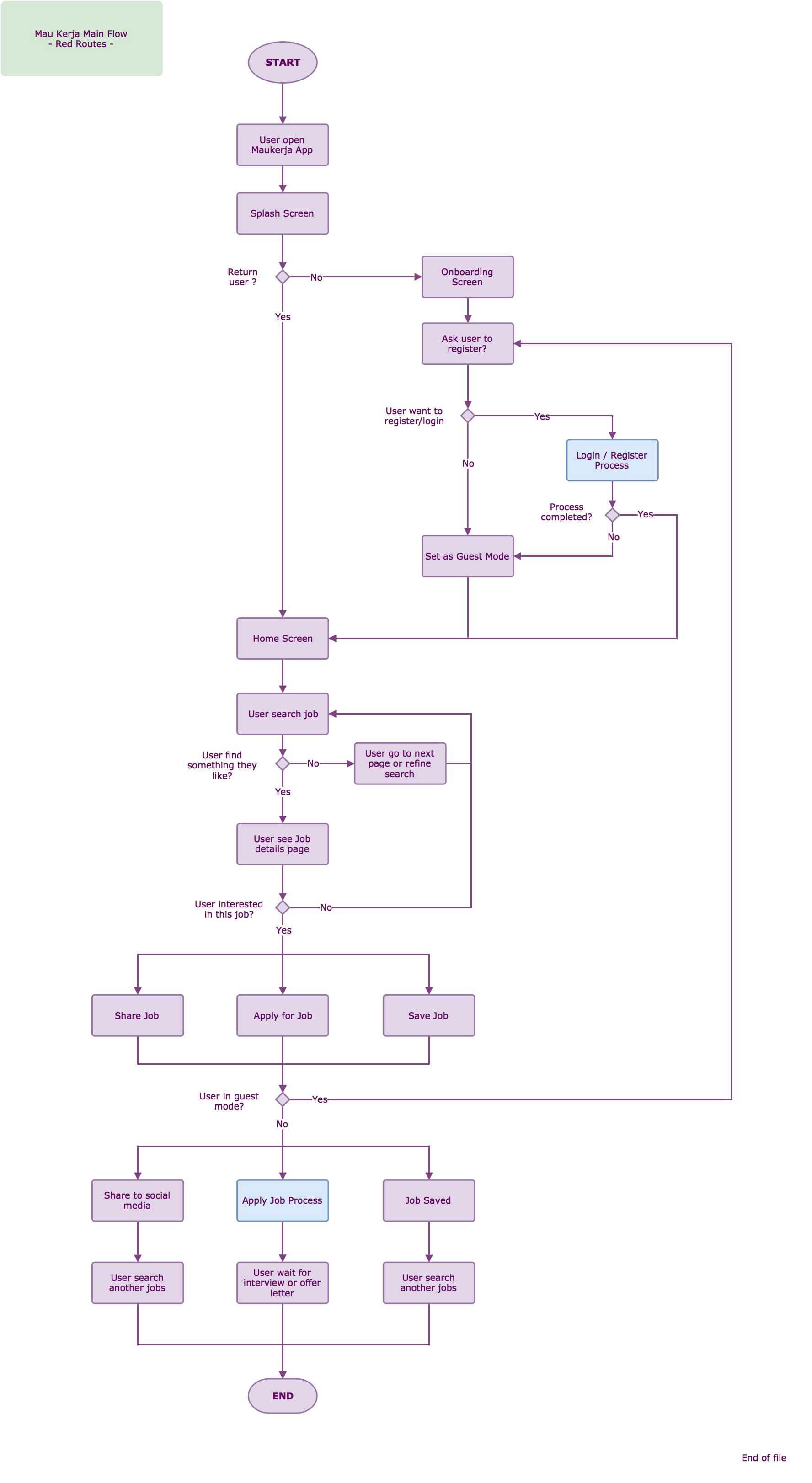
Maukerja App Main User Flows
Low-Fis and Mid-Fis Design
Finally, we reach the design stage of our redesign, I began designing low-fidelity wireframes and then converted them into mid-fidelity wireframes in Sketch App. All of this needs to be presented to the stakeholders and ask for their feedback and approval.
A mid-fidelity prototype is a prototype with limited functionality but clickable areas which presents the interactions and navigation possibilities of an application. Mid-fi prototypes are usually built upon storyboards or user scenarios. The mid-fidelity prototype is suited for the validation of the interaction concept.
Mid-Fidelity on actions. It gives more accurate depictions of the layout, and detail around how things will work.
Design Decisions and Features
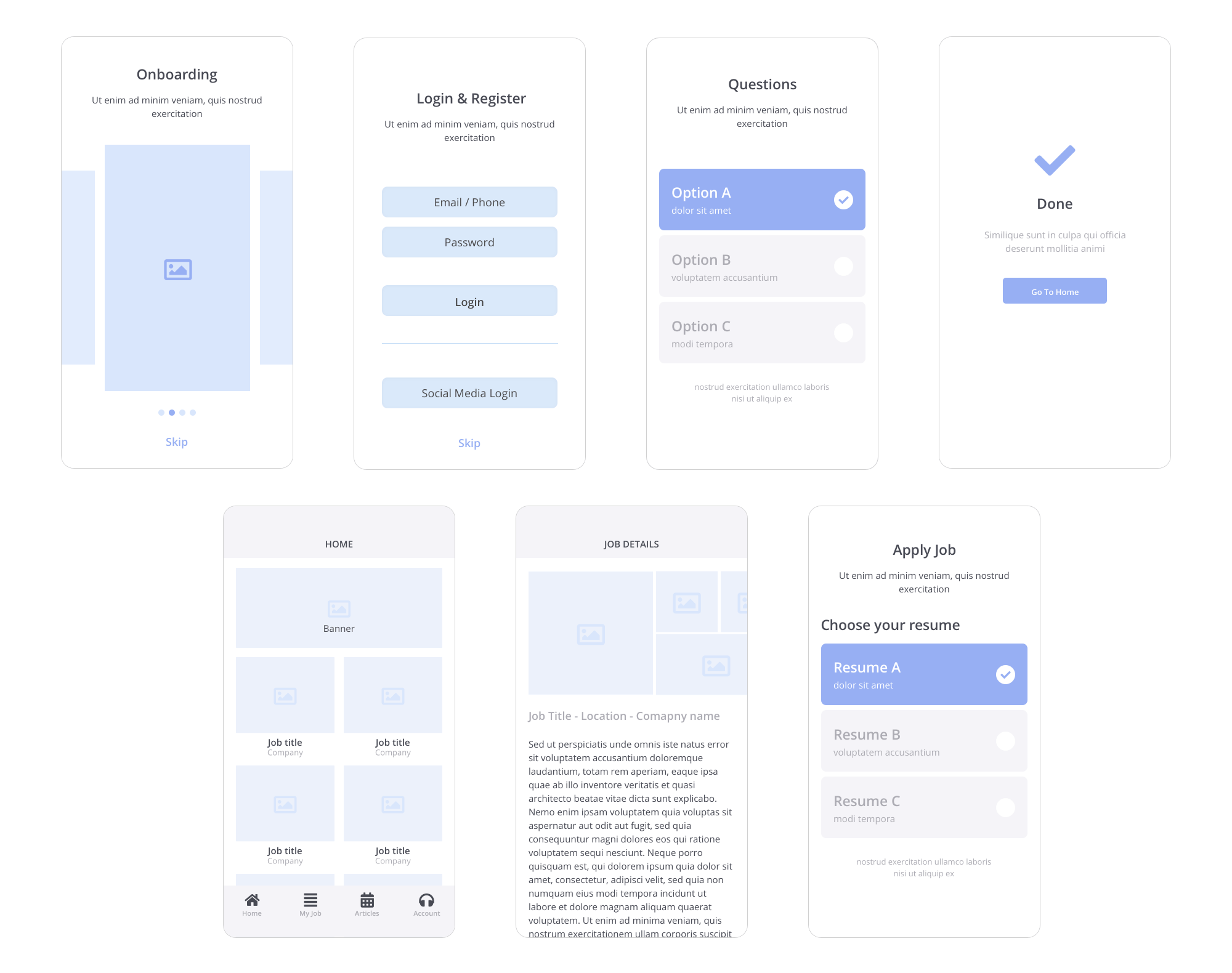
Onboarding
In the app's original design, there is no onboarding page. Based on our research and usability test, the users want to know if there is a suitable job for them right away soon after they arrived at the home page. To be able to 'predict' what they want, we will ask several questions about their interest and cook that data to recommend few jobs that match with their characteristics on the home page.
The login page from the existing Maukerja App. It doesn't have any onboarding.
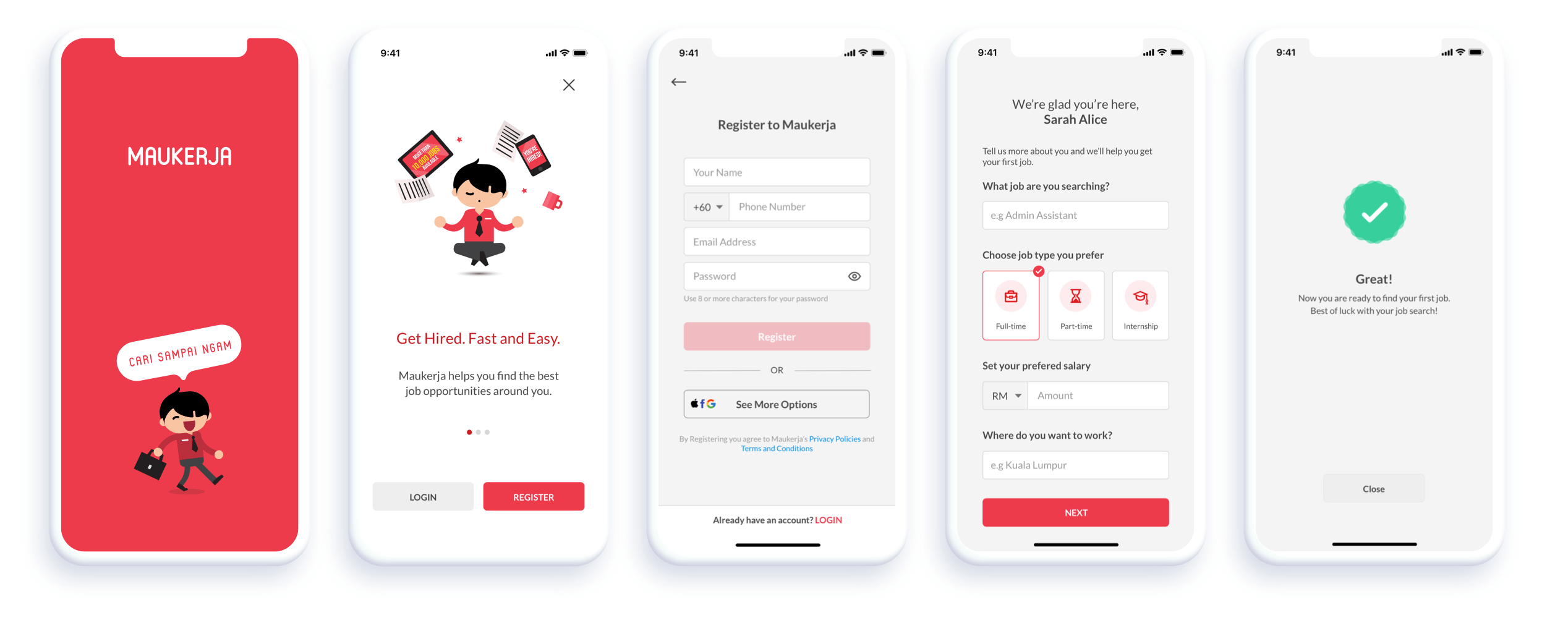
(From left) Splash Screen, Onboarding, Register, Onboarding Questions, Finish Screen
The Home Page
Maukerja's original job listing was not very user-oriented. Once a user arrived at home, they will see lists of jobs based on the latest post/update. That is not a very good system as people could end-up seeing lots of jobs that they did not interest in and not relevant to their past experiences. Going back to our users, Our users want to find a job right away.
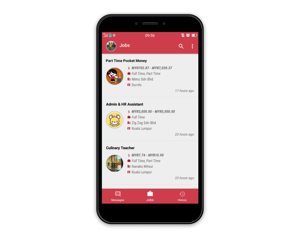
The home page from the existing Maukerja App
We believe every user is unique and user experience is about meeting a consumer's needs on an individual level — a "segment of one" not "one-size-fits" all. But what does that look like in practice?
Personalized Job Feeds. The first screen user will see when open the app is the home screen. We filled the home page with lots of jobs based on their interest. We collect data from their location, the information they input from the onboarding page, their past working experiences, and their education history.
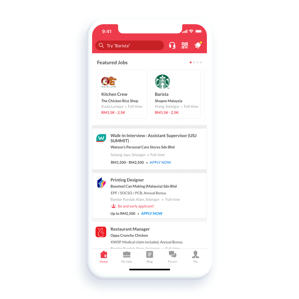
The new and improved home page. Each job is based on the user's interests.
Apply for Job
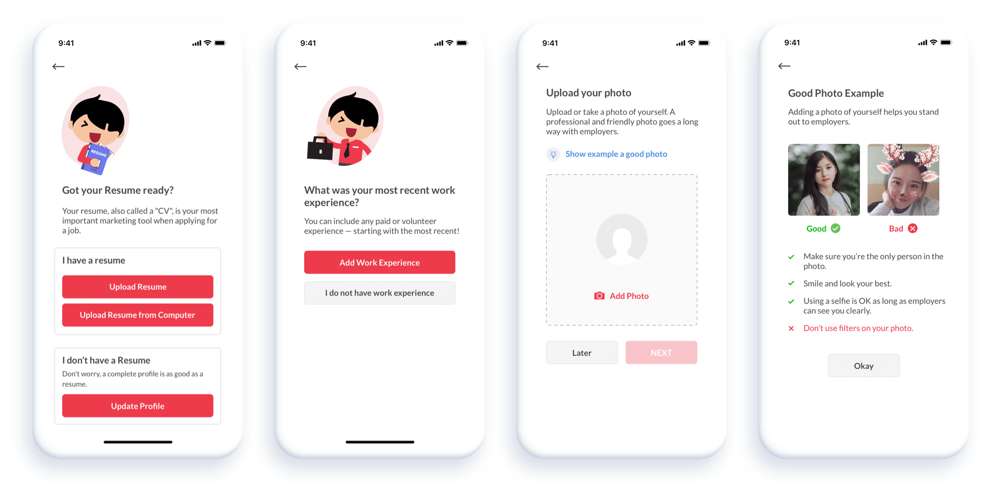
We remove the apply via chat and replace it with a new application flow and a thank you page at the end.
To ensure easy-to-use apply, we are using a per-section-question. Because we will have "custom questions" from the employer that needs to be answered, the per-section-question will come in handy for the developers to code. Also, an apply confirmation screen before the user sends the application, they have a right to cross-check and confirm all the information they are going to submit. On top of that, we also added application-edit modals, in case of users want to edit some information before submitting it.
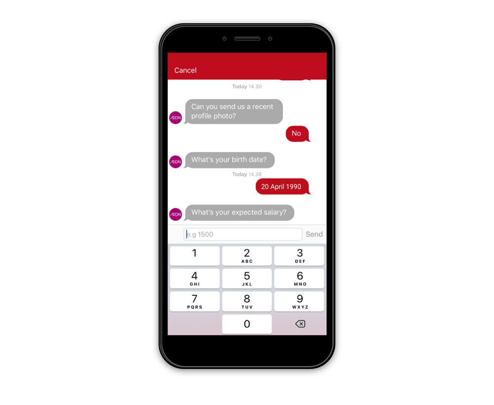
The apply via chat process from existing Maukerja App
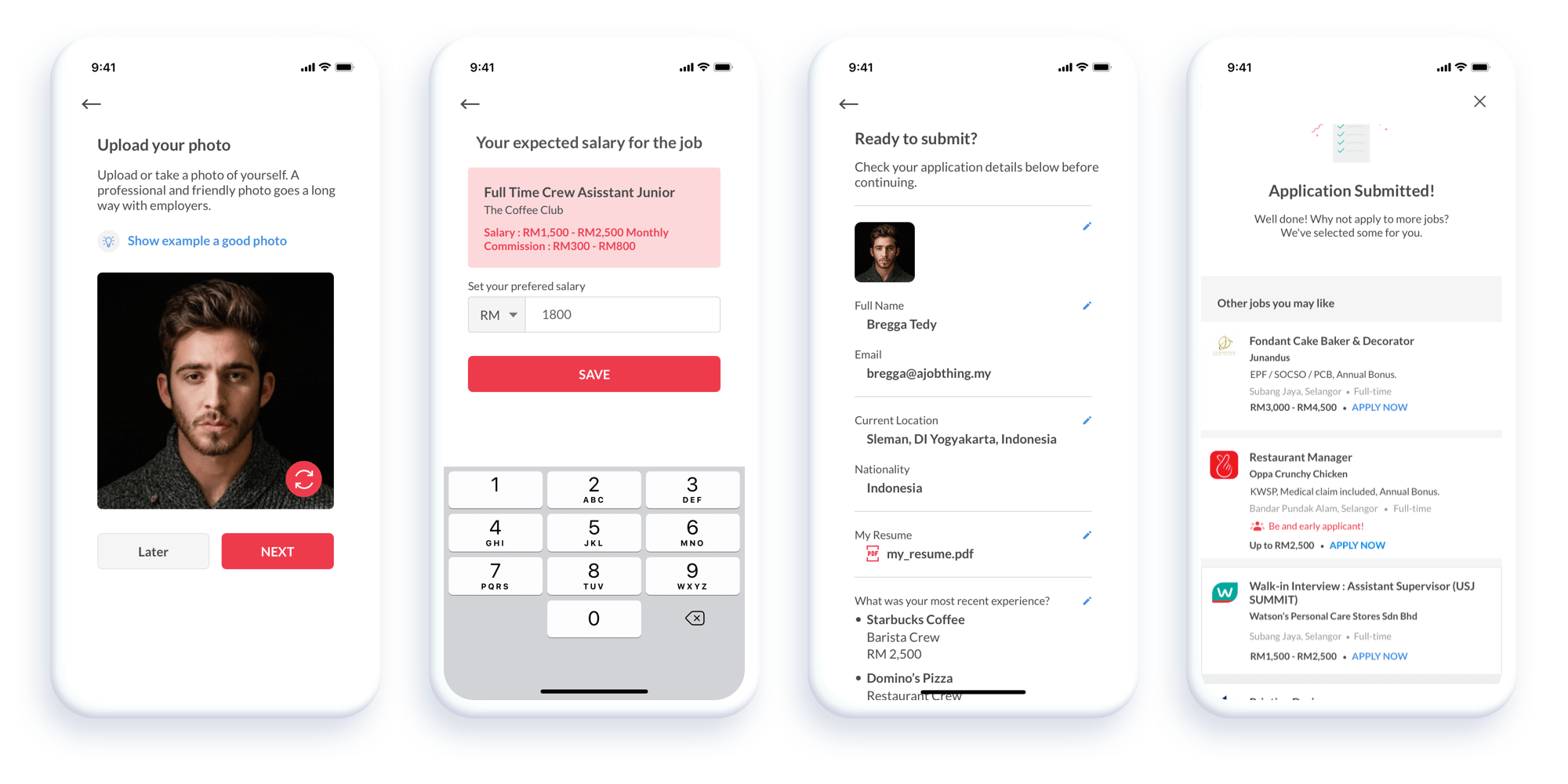
The new and improved Apply Page. Each screen has additional information to guide the user through the process.
Information will be saved and we won't ask the same questions again when the users apply for the job for the 2nd time. They always view the confirmation screen and able to edit it before submitting the application — Neat.
User's Profile
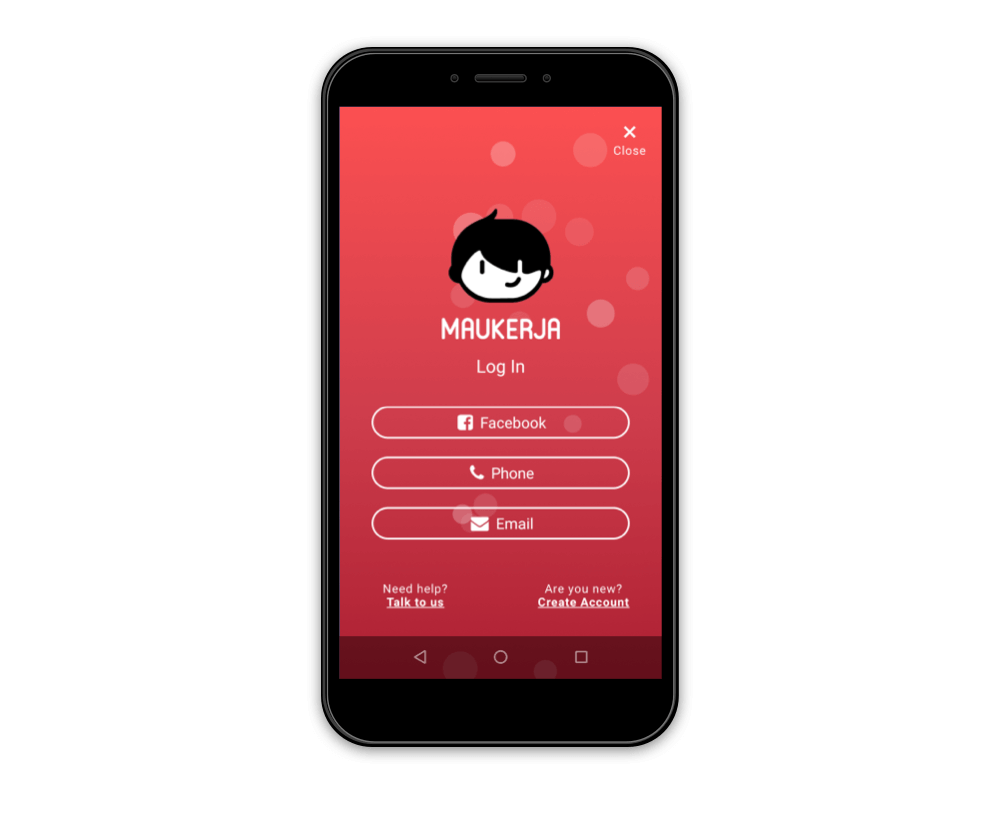
In the app's original design, the user profile page showed the following: photo, username, first and last name, gender, about, and city. Based on our research, we know that our users need a beautiful profile to show when it comes to dealing with the employer. It gives them confidence.
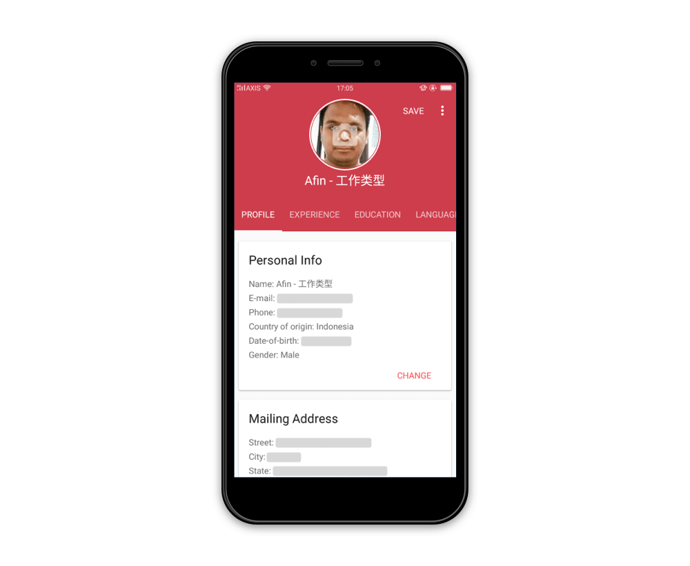
The profile page from the existing Maukerja App
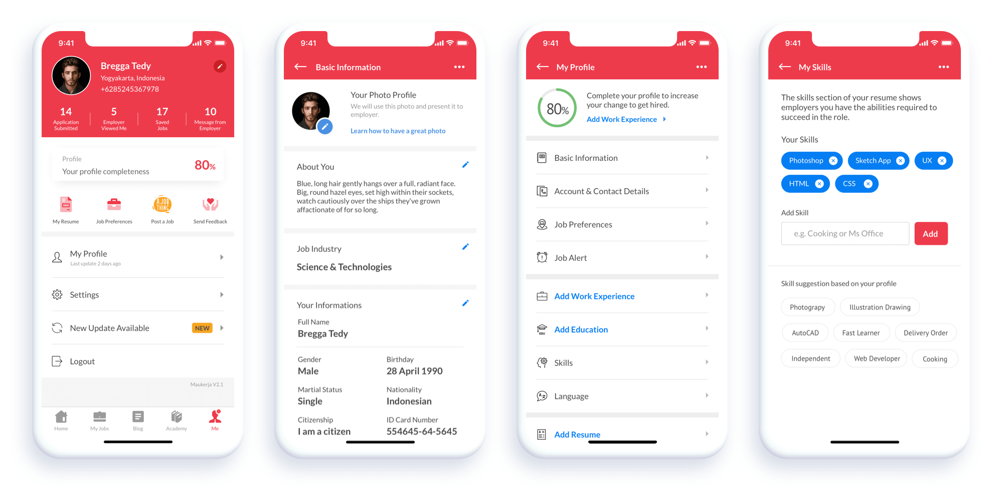
The new and improved Profile Page. (from left) User Page, Basic Information, My Profile, My Skills.
We highlight the profile completeness to emphasize to our users that it is important to have your profile complete. Our data shows that job seekers who have 85% profile completeness will likely get twice as many interview invitations as job seekers who are not. We also recommend to the user which section of their profile needs to be filled. The suggestion is based on the priority level.
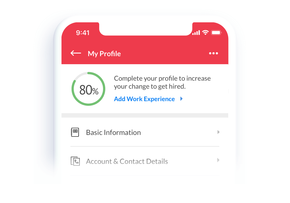
The app suggests the job seeker add a work experience
The AB Testing
After we developed it and got QA passed, we will roll-it-out to 50% of our users. We will monitor and gather the user feedbacks in a week. Why 1 week? Because we already have lots of active daily users, and we will get enough data in 1 week to play with.
Issue: Finding Jobs
The results are in! We are satisfied with the result so far. The job application is increased around 34.6% for the past week. But we thought we can do much more. We felt that we can multiply the job application rate by twice the target. So we discuss more 'user needs and user choices'.
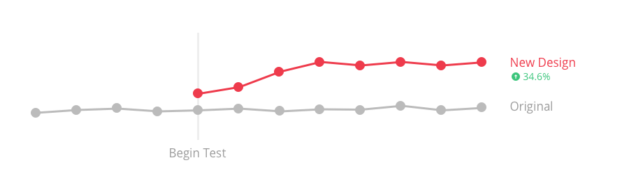
AB Test Result after a week deployment
Design Iteration
The new wave of UX design is centered around personalization. Personalizing for those experiences is difficult because we don't really know the users, their needs, or their goals.
What if jobseeker can choose their own personal home page screen?
Oh right.. , we allow them to customize the home screen page based on their interest — A Personalize Job Category!
Introducing the My Favorite Tab — which allows users to personalize the top tab and build unique experiences that lead to increased engagement and better outcomes. It contains lots of recommendation jobs based on their interests.
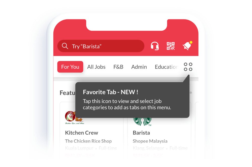
My Favorite Tab: For You, All Jobs, Food & Beverage, Admin, and Education section
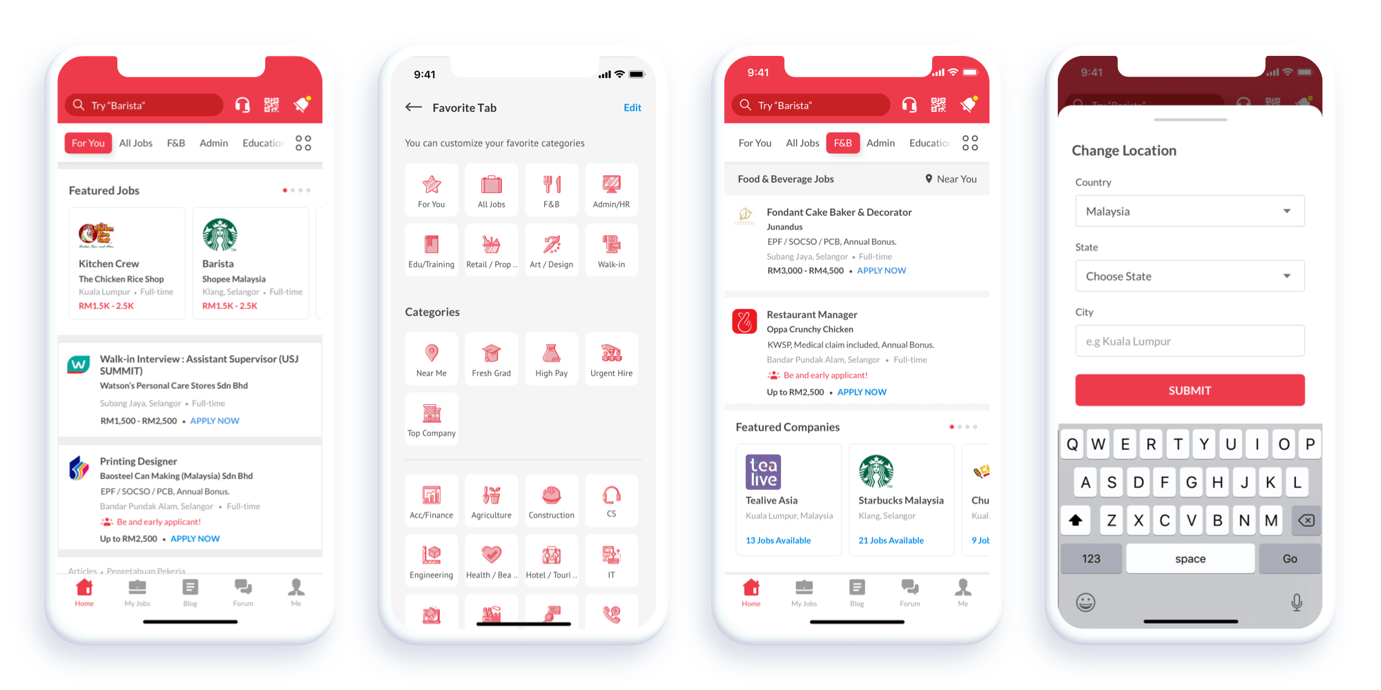
Users can customize the tab based on their interests and set the job location too. It's like the app is tailored for each user.
The Results
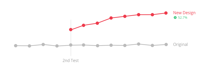
A/B testing is all about making those incremental improvements. And while big changes are possible, any improvement is a great start and puts us on the right path.
Even when the data shows we haven't made a great improvement, we're now in a stronger position than before as we can confidently state what does and does not work.
2 weeks after the deployment, I'm happy to see a 50% increase 👏👏
At the beginning of this article, I said that we created an engine for job recommendations — which is called the Harmony Engine. This engine will work better every day because we train it with a lot of data.
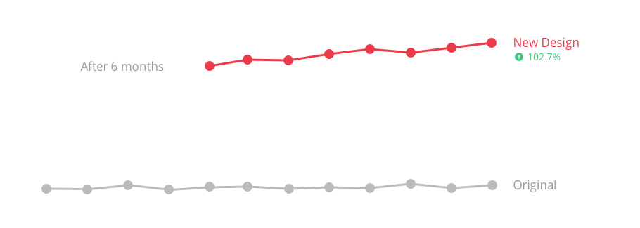
After 6 months of this feature being deployed (and also adding several new features in the app), we finally managed to increase the job application twice from the initial number.
Well done team! 👏👏
Summary: Do it with your team
Final Thoughts and Future Steps
This project was definitely a challenge but a very rewarding one. 1 month was obviously not enough time to redesign all the screens for Maukerja App, however, we believe that we tackled the project successfully. Our final product met the needs of our user persona by being simple, informative, and intuitive. If given more time, we would love to explore the user's settings page and add tutorials for new users as well.
Some potential features that could set Maukerja App apart from its competitors:
-
Personalized My Favorite Tab and suggest job-based on user's interests
-
On-boarding page to explore user's interests
-
The UI is easy-to-use and tailored for blue-collar job seekers
Learnings
This project taught me that when it comes to re-design, you need to focus on what the user needs in the best way. There's never any harm in trying something new, however, typically when people are used to seeing a certain design, they're going to expect to see it in other products. So designing a feature that has rarely been seen before might not always be a good idea. The best way to find out is to test it and iterate.